Translation & Note by John Solt
[Kitasono Katue (1902-1978), whom Pound admired & renamed Kit Kat, was on his own grounds a major, truly experimental poet & artist. Beyond that, in the 1950s, he designed the first four covers of Black Mountain Review for Robert Creeley, & Creeley’s Divers Press published a book of his poems in his own English translations & containing a few of his colored drawings. To get a sense of what should be his prominent place in international avant-garde poetry & art, check out the range of selections in oceans beyond monotonous space at http://www.thing.net/~grist/ld/japan/kitasono.htm along with John Solt’s “Shredding the Tapestry of Meaning – The Poetry and Poetics of Kitasono Katue. A full presentation of his visual & plastic poems is also long overdue. (J.R.)]
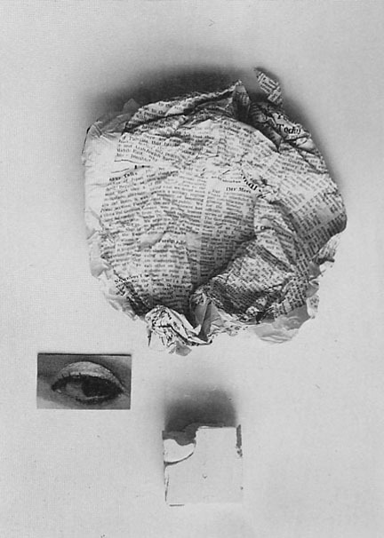 |
| Kitasono Katue: Plastic Poem (Even from Trifling Objects), 1966 |
MONOTONOUS SOLID
in the mirror
turtle's
egg
burst
summer's burst
gloom's
shadow's burst
that bubble
that hopeless
wing
or
that
avalanche
of
clouds
one drop
of my location
and
stripe
of tragedy
and
circle
of loneliness's
head
that
verticality
that
blanc d'argent
that
illusion
that
burst
imagination's
face's
curved line's
dark
jaw's
hard loneliness
that craving
voice
is full of
gloom's forest
the day
also passes
for
an extremely fast
fly
needle
of white cone's
distance
needle of bread and
water
lead moon
repudiates
lead flag
dream's
butterfly's
burst
on
top of smashed plates
still voluptuously
fragrant
black firearm
death's
burst
inside
hot glass bottle
star's
water's
dahlia's
extraordinarily visible burst
OU UNE SOLITUDE
glass
inside
glass
that
curved line
and
within
it
gloomy
seashell
above
one
stem
the
wind
a
plate
for
tragedy's
plate
one star
breaks
one
star
departs
for
purple's
yellow
wreath
there
are
purple
yellow
wreaths
one
star
departs
one
star
sits
down
crying
BLACK PORTRAIT
(followed by sample pages of original typography and notes)
hopelessness's
alcohol's
purple
moustache
or shadow's
egg
inside
cage
of
bones
distance
of
night
of
death's
turtle
solitude is
wetted
by
black
rain
rotting
in
ladder
shape
that
wall
that
brittle
cone's
lonely
part
ON THE TYPOGRAPHY OF BLACK FIRE
from John Solt's Shredding the Tapestry of Meaning
Each page (of Black Fire) contains only one or two lines, positioned near the top of the page. These fill approximately 5 percent of the page, thus creating a tension between the type and the blank space. If Katue had not shortened the page, the disproportion between print and emptiness would have been even more pronounced. Another striking feature of the design is that the poem titles are printed in red ink and the poems in black, thus reinforcing the theme of a "black fire."
More radical than the short line lengths and the two-color lettering is the innovative way the poems of Kuroi hi are to be read: top to bottom and right to left. For other modern Japanese poetry, the eyes move vertically and then shift a line to the left and proceed down it, and a page is read right to left; or, when the type is laid out sideways as in the case of European languages (common these days), it is read from left to right. Katue essentially throws his readers off-balance by forcing their eyes to move horizontally in the "unnatural" direction of right to left. (On the rare occasions when Japanese was written horizontally in the past, the common direction was from right to left, and in a sense Katue was reverting to an old practice; it is, however, new to modern poetry.) He was the first poet in Japanese, as far as I know, to use a "double axis" of vertically down and horizontally right to left, thus rattling the reading process. Following is a transcription into directional signs for reading (down and right to left) "Kuroi shozo" (Black Portrait), one of the most extreme poems in the double-axis mode. Each letter or number stands for one graph; letters are read vertically (top to bottom) and numbers are read horizontally (right to left), starting at the top right-hand corner. The common form by other poets could include a string of letters ad infinitum, but would never have a number higher than 1.


No comments:
Post a Comment